
1. Context
Video To SRT is a desktop tool that generates subtitles from video files. It handles transcription, translation, and subtitle styling and export, tailored specifically for content creators who need completely offline, privacy-first workflow without uploading massive files to the cloud.
The app naturally features a vast array of configurable options, from subtitle styling to translation engines. All of these options are legitimate and necessary for power users, but a first-time user simply wants to drop in a video and get subtitles without friction.
2. The Problem
How do you design a single interface that serves both casual users and power users without overwhelming either?
-
1Cognitive Overload
Transcription alone has multiple AI engine options, language settings, and output formats. Putting everything on one screen dramatically increases decision time.
-
2Intimidating First Impressions
A settings-heavy UI signals that the app is complicated before the user even starts. If casual users bounce due to a cluttered interface, they never discover that the tool is actually easy to use.
3. The Solution
I implemented Progressive Disclosure, splitting the interface into two distinct layers: a Simple View and an Advanced View.
-
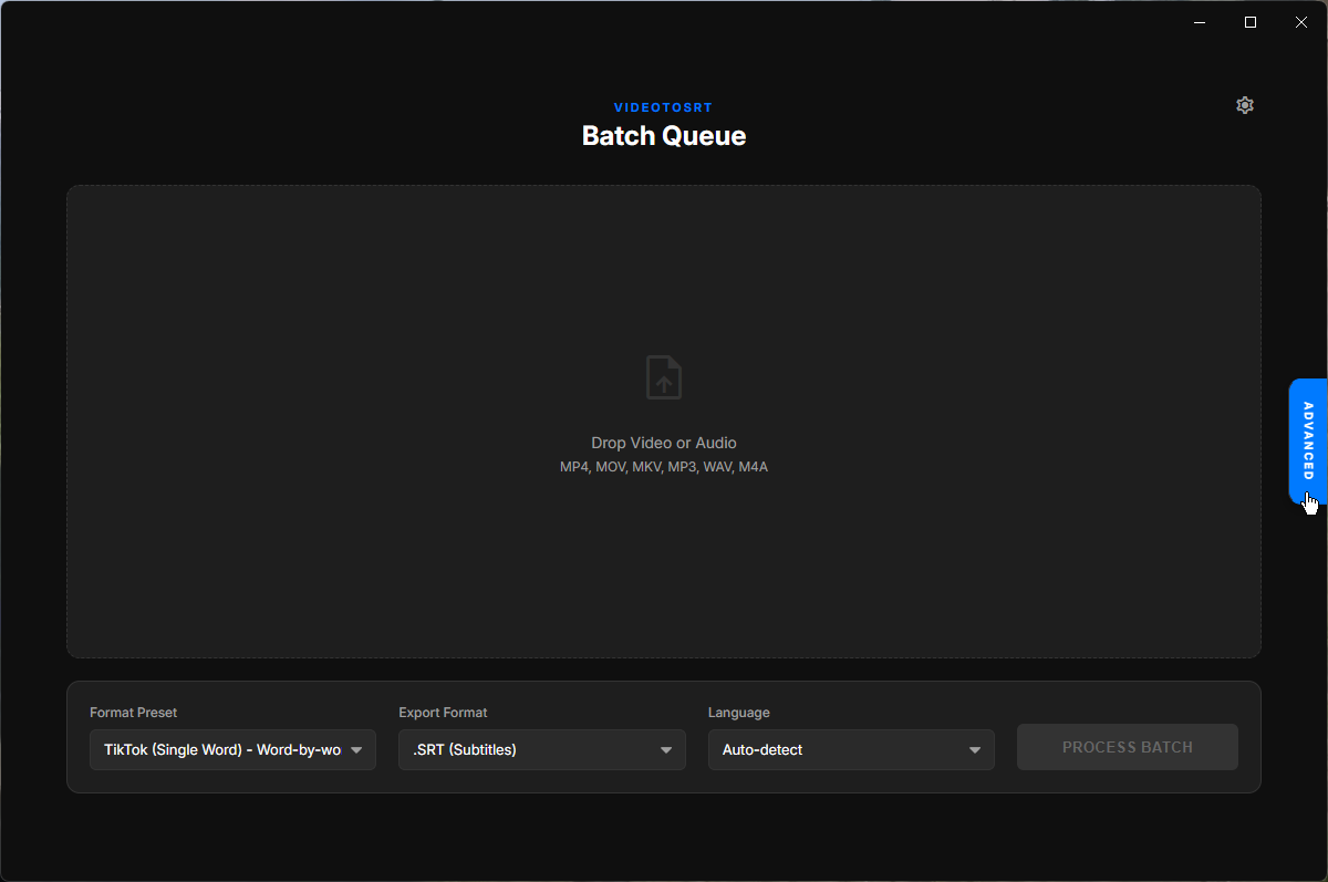
1Simple View (The 80% Case)
Designed for drop-and-go usage. I created targeted presets like "Fast English Transcript" and "Direct Translation to English" that bundle complex decisions (model size, auto-detection, compute type) into a single click.
-
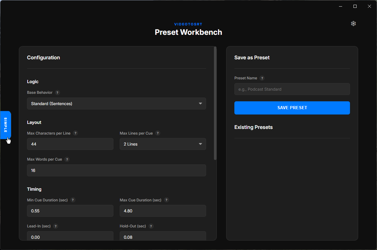
2Advanced View (The 20% Case)
Designed for users who need granular control. It exposes all options including AI model selection (e.g. Whisper Tiny vs Large), hardware compute limits, and exact subtitle timing, accessible via a prominent toggle switch.
-
3Cohesive Mental Model
Simple presets map directly to Advanced settings. If a user picks a preset and switches to Advanced, they see exactly what that preset configured, proving the two views are connected layers of the same application.
4. Design Thinking
Why this approach successfully serves both audiences, and next steps.
-
Progressive Disclosure
By showing only what's needed at each level of user engagement, we completely avoid front-loading complexity and cognitive friction.
-
Recognition Over Recall
Presets utilize descriptive names so users pick based on their goal, rather than having to remember what each technical setting does.
-
Seamless Visual Consistency
The Advanced view expands in-place, sharing the exact same typography, layout spacing, and color language as the Simple view, ensuring the transition feels like opening a drawer rather than opening a new app.
As a next step, I would track telemetry on how often users transition to Advanced mode and which presets see the most volume, allowing us to inform and refine the default settings over time.